Analytics April 22, 2025

Workplace Utilization Data Compared to Google Mobility Report

By Yahya El Iraki
Outlook vs MySeat

Workplace Utilization Data Compared to Google Mobility Report

This report examines the impact of COVID-19 on office usage by comparing two very different data sources: MySeat’s workplace occupancy data and Google’s Community Mobility Report for workplaces. Our goal was to see how closely the trends in MySeat’s sensor-collected data align with Google’s GPS-based mobility data during the pandemic, focusing on the province of Quebec. If the patterns match, it validates that MySeat’s anonymous, asset-based data can capture broad workplace utilization trends.

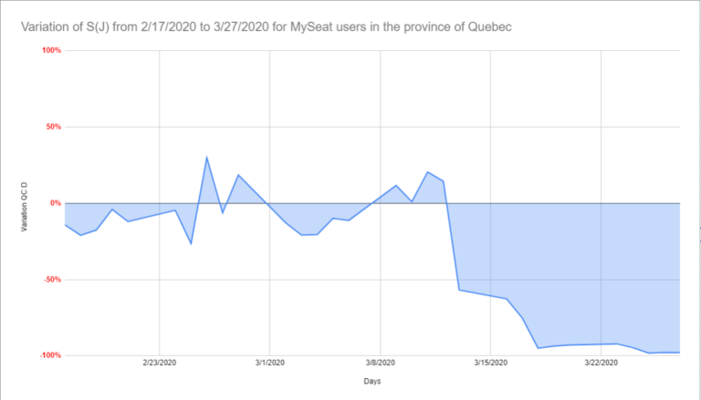
The study found that MySeat’s office utilization metrics closely mirror the overall trends observed in Google’s mobility data, with both data sets showing a sharp decline in workplace activity during the early pandemic period. However, there were also key differences – notably, MySeat data showed an even earlier and steeper drop in activity. This is likely because Google’s data includes a wider array of “workplaces” (including essential services) whereas MySeat’s data is specifically from corporate office environments where work-from-home was more universally adopted. Below, we detail the findings and implications.

Data Sources and Methodology

MySeat’s dataset consists of anonymous occupancy readings from multiple office venues in Quebec, collectively serving around 10,000 employees. These readings come from MySeat’s wireless IoT sensors on office furniture and workstations, which report when and how spaces are used. Google’s Community Mobility Reportmyseat.io, on the other hand, uses aggregated, anonymized location data from smartphones to track movement trends across broad categories (one of which is “Workplaces”). For Quebec, Google’s workplace category includes anyone whose phone data indicates they are at a workplace location (offices, factories, stores, etc.).

To compare apples to apples, we aligned both data sets over the same timeframe. We used Google’s definition of a baseline period (January 3 – February 6, 2020) as a reference for normal activity levels before COVID. For each subsequent day, Google reports the percentage change in workplace mobility relative to that baseline. We computed a similar metric for MySeat: the daily percentage of active workstations relative to the pre-COVID baseline, across our client sites.

By plotting MySeat’s Occupancy Index against Google’s Workplace Mobility Index over the first 7 weeks of the pandemic (mid-February to end of March 2020), we could directly visualize how the trends compared.

Here in Québec: Early Pandemic Response

In Québec, the provincial government highlighted Google’s mobility data in early April 2020 as proof that people were adhering to confinement measures. During an April 8, 2020 press briefing, Quebec’s premier noted that the Google report showed Quebec leading in social distancing compliancemyseat.io. Naturally, at MySeat we were curious – were our own clients’ office utilization data showing the same thing?

MySeat had been proactively helping clients use their occupancy data from the pandemic’s start. As offices emptied in March 2020, we advised clients to monitor their dashboards to ensure the transition to remote work was happening as expected (and to catch any anomalies, like people coming in when they shouldn’t). This gave companies a real-time pulse on occupancy, helping them verify that work-from-home policies were being followed and, later, to identify when activity started picking back up as restrictions evolved.

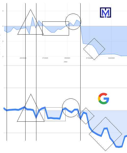
When we overlayed MySeat’s data with Google’s, the similarities were striking. Visually, the two curves – MySeat’s workplace occupancy and Google’s workplace mobility – dipped and rose almost in sync:

  • Both data sets showed a steep decline in activity in mid-March 2020 as lockdowns took effect.

  • The “knee points” (sudden inflection points in the curves where activity drops or rises) occurred at nearly the same dates in both datasets, indicating that both MySeat sensors and Google’s location data captured the timing of when people stopped going to workplaces.

  • Overall patterns week-by-week were closely correlated. When graphed, you can see the same waves in both, with only minor deviations.

These similarities suggest that asset-based occupancy sensing can reflect broader human mobility trends. Despite using completely different technologies (sensors on chairs vs. smartphone GPS), both methods clearly registered the massive shift to remote work.


Here in Québec

Excerpt “Google prepared a report to help their users and health officials understand responses to social media. distancing guidance related to COVID-19. Google mobility report shouldn’t be used for medical diagnostic, prognostic, or treatment purposes. It also isn’t intended to be used for guidance on personal travel plans. Location accuracy and the understanding of categorized places varies from region to region, so we don’t recommend using this data to compare changes between countries, or between regions with different characteristics (e.g. rural versus urban areas). We’ll leave a region out of the report if we don’t have statistically significant levels of data. To learn how we calculate these trends and preserve privacy, read About this data.”

Excerpt Google

Similarities in the results

Trend similarities can easily be visually identified as being closely correlated. The comparison shows the following results:

The overall patterns are similar (averaging a distortion due to known factors) and knee points of both curves have close timestamps (nearly synchronized) and they occur in the same chronological order for both data sets. We can recognize similarities within the areas highlighted by different geometrical figures.


Key Differences and Insights

While the trends were aligned, there were notable differences in magnitude and nuance:

  • Speed and Magnitude of Decline: MySeat’s data showed that office occupancy in our sample fell earlier and faster than Google’s workplace mobility index did. By the end of March 2020, MySeat’s measured office activity was down 97% from the baseline, whereas Google’s workplace category for Quebec was down about 44%. This makes sense – MySeat’s clients are mostly corporate offices, where almost everyone went remote, whereas Google’s data still included “essential workers” (healthcare, manufacturing, etc.) who continued to commute. In short, corporate offices emptied out more completely than the broader category of all workplaces.

  • Temporary Comebacks: In Google’s data, there were a couple of small upticks – brief resurgences in workplace activity – during the early lockdown period. These could be due to people occasionally returning to work (for example, to pick up equipment or due to unclear guidelines). MySeat’s data showed barely any such upticks for our clients; once offices emptied, they stayed largely empty until restrictions eased. This again reflects that many Google-tracked “workplaces” included places that couldn’t shut down entirely or had staggered schedules, whereas our corporate office clients were largely consistent in staying closed.

  • Inclusion of Essential Workplaces: Google’s mobility report inherently includes essential workplaces – e.g., hospitals, grocery stores, pharmacies – because those workers kept traveling to their jobs. MySeat’s data excludes those, focusing on corporate offices. The presence of essential workers in Google’s data is a big reason its workplace activity didn’t drop as low as MySeat’s. We estimated at least 600,000 essential workers in Quebec were still active during that period. These essential workers likely account for the roughly 46% workplace activity that Google still saw when office buildings were otherwise empty. In other words, that remaining activity in Google’s curve was happening outside of corporate offices.


Methodology Details (Baseline and Calculation)

For transparency, here’s how we derived our metrics: Google defined the “baseline” for workplace mobility as the median value for the corresponding day of the week during the 5-week pre-pandemic period (Jan 3 – Feb 6, 2020). Every day’s mobility is a percentage relative to that. We applied the same concept to MySeat’s occupancy data. We calculated a daily Occupancy Score for each day J as the percentage of workstations active, then compared it to the baseline (average active workstations on that weekday pre-COVID).

This gave us a daily percentage change figure for MySeat, which we could line up directly with Google’s daily percentage change. Both data sets were then plotted over the 7-week period from February 16 to March 29, 2020. We also rescaled the Y-axis for each graph for easier visual comparison (since the absolute percentages differ significantly, as noted above).


Privacy Considerations: Asset Data vs. GPS Data

One interesting outcome of this study is the spotlight it shines on privacy in data collection. MySeat’s approach uses asset tracking – sensors on chairs and desks – which yields anonymous data by design. We only know whether a workspace is in use, not who is using it. The Google Mobility Reports, meanwhile, rely on personal mobile phone data. Google has to implement safeguards, like not reporting data for regions with small sample sizes to avoid privacy risksmyseat.io. In fact, Google adds a disclaimer that the mobility reports shouldn’t be used for medical or policy guidance, in part because of these privacy and sampling caveats.

With MySeat’s occupancy analytics, privacy is inherently protected (no personally identifiable information is collected at all), allowing our clients to access real-time utilization data without concern for individual tracking. The Google data, while immensely useful on a societal level, is aggregated and delayed – it’s not real-time, and it must obscure certain details to ensure anonymity. This means asset-based data can often be more straightforward for an analyst: there’s no need to filter out personal identifiers or wait to accumulate enough mobile data. It’s a cleaner data set when you want to understand trends in a specific office portfolio.

Google’s scale is of course unmatched – with billions of smartphone users, their reports cover far more geography and population. MySeat’s data is more granular but limited to the buildings equipped with our sensors. In practice, the two data sources serve different purposes. Google’s mobility trends give broad public insights (e.g., how a whole province or country is behaving), whereas MySeat’s data gives actionable insights for individual organizations (e.g., “our office occupancy is down 97%, time to adjust our lease or policies accordingly”). Both have value, and together they tell a consistent story about the early pandemic: offices emptied out dramatically, and any return to them has been cautious and partial.

Validating IoT Data for Workplace Analytics

This comparative study confirms that MySeat’s IoT sensor data can effectively capture workplace utilization trends in line with larger-scale mobility data. For our clients, this is reassuring – it means the patterns they see in their own building analytics are reflective of real-world behavior at large. The earlier drop-off detected by MySeat highlights how responsive corporate offices were during COVID, and underscores the advantage of having dedicated analytics for your own facilities (which can detect changes immediately, not weeks later).

Looking ahead, the implications go beyond the pandemic. Expanding the Internet of Things (IoT) in workplaces can empower organizations and communities to measure and respond to trends without infringing on individual privacy. Anonymized occupancy sensors, like those used by MySeat, provide a path to understanding how spaces are used (or not used) in real time, which can inform everything from energy savings (shutting down unused areas) to lease decisions.

Google’s mobility reports have been invaluable for public policy and awareness, but as they themselves note, there are ethical considerations and delays in using personal location data. Asset-based data solutions offer a complementary approach – one that is immediate and inherently privacy-preserving. The lesson from COVID-19 is that having multiple data perspectives enriches our understanding. In this case, both data sets agreed: by late March 2020, office activity in Quebec had plummeted, validating that drastic measures were taken and largely followed. Where they differed – the depth of the drop – we learned why: different data scopes (corporate offices vs. all workplaces) and the inclusion of essential workers.

In summary, MySeat’s workplace utilization analytics not only helped individual clients navigate the crisis, but in aggregate, they painted a picture consistent with global tech giants’ data. That’s a strong testament to the power of smart office sensors and their role in modern facility management. As we move into a future of hybrid work and uncertain office demand, such tools will be crucial in making data-driven decisions while respecting the privacy and comfort of employees.